Milk, meat and blood: how diet drives natural selection in the Maasai

This post is a little different from the usual fare at this blog, as I am discussing a paper on which I’m a co-author. My collaborators and I just put up a paper in the open-access journal PLOS ONE. We analyzed genetic data from members of the Maasai tribe in Kenya and detected genes related to lactase persistence and cholesterol regulation that are under positive selection.

The Maasai and their Diet
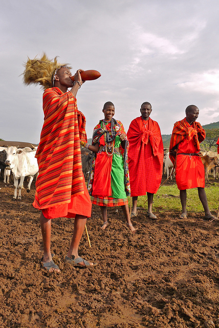
Maasai tribe member drinking blood. Image credit: Rita Willaert

The Maasai are a pastoralist tribe living in Kenya and Northern Tanzania. Their traditional diet consists almost entirely of milk, meat, and blood. Two thirds of their calories come from fat, and they consume 600 – 2000 mg of cholesterol  a day. To put that number in perspective, the American Heart Association recommends consuming under 300 mg of cholesterol a day. In spite of a high fat, high cholesterol diet, the Maasai have low rates of diseases typically associated with such diets. They tend to have low blood pressure, their overall cholesterol levels are low, they have low incidences of cholesterol gallstones, as well as low rates of coronary artery diseases such as atherosclerosis.

Even more remarkable are the results of a 1971 study by Taylor and Ho. Two groups of Maasai were fed a controlled diet for 8 weeks. One group – the control group – was given food rich in calories. The other group had the same diet, but with an additional 2 grams of cholesterol per day. Both diets contained small amounts of a radioactive tracer (carbon 14). (You’d never get approval for a study like this today, and for good reason.) By monitoring blood and fecal samples, the scientists discovered that the two groups had basically identical levels of total cholesterol in their blood. In spite of consuming a large dose of cholesterol, these individuals had the same cholesterol levels as the control group.

Here is how the authors concluded their study:

This led us to believe, but without direct proof, that the Masai have some basically different genetic traits that result in their having superior biologic mechanisms for protection from hypercholesteremia

Motivated by these results, we set out to identify genes under selection in the Maasai as a result of these unusual dietary pressures. We scanned the genome looking for genetic signatures of natural selection at work.

The Data

Our data comes from the International HapMap Project, a collaborative experimental effort to study the genetic diversity in humans. The HapMap Project has collected DNA from groups of people from genetically diverse human populations with ancestry in Africa, Asia and Europe. Their anonymized data is publicly available for free. One of the HapMap populations is a group of Maasai from Kinyawa, Kenya  (n=156), and this is the population that we focus on.

DNA sequences on a part of Chromosome 7 from two random individuals, with the differences shown in red.

HapMap does not sequence full genomes, as this would have been prohibitively expensive at the time of data collection. Instead, they employ a shortcut. If you take my DNA sequence and line it up against yours, the two sequences will be about 99.9% similar. But every once in a thousand letters, or so, there will be a difference. You may have an A where I have a C. The HapMap group measures the DNA sequence at these very locations, where humans are known to vary from each other. In essence, they’re sampling the genome, looking only at sites where we expect to see variation. In the jargon of the field, this method is called looking for Single Nucleotide Polymorphisms, or SNPs (pronounced snips).

Hunting for signatures of selection in genetic data

Once you have the data, what can you do with it? We wanted to detect signs of natural selection. The basic idea behind detecting selection in genomic data is quite simple, and it has to do with sex. Every sperm or egg cell that you produce contains a single genome, which is formed by shuffling together the two sets of genomes that you inherited from your parents. Viewed this way, the role of sex is to shuffle together the genomes in a population into new combinations. If you compare the DNA sequences of a group of people, you will see signs of this shuffling.
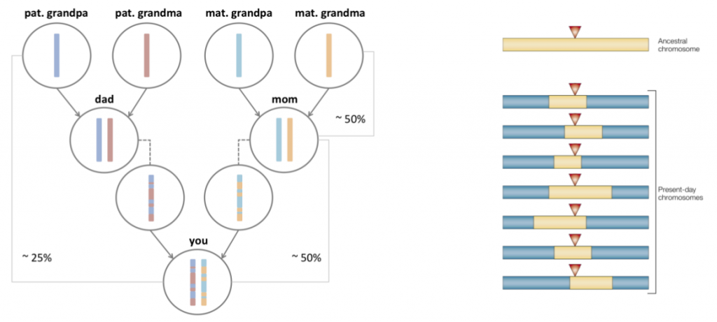
The effect of sex is to shuffle genomes, in a process known as genetic recombination.

Now lets add natural selection to the mix. What happens if an individual is born with a new mutation that benefits their survival? Over time, you’d expect to see this mutation rise in frequency. Descendants of this individual will be over-represented in the population, as the fraction of people with this beneficial mutation goes up. In essence, the fingerprint of such selection is a reduction of genomic diversity. (I’m describing a particular model of selection here, known as positive natural selection. Some other types of selection can increase diversity, such as the selection on viruses to evade recognition by their host’s immune system.)
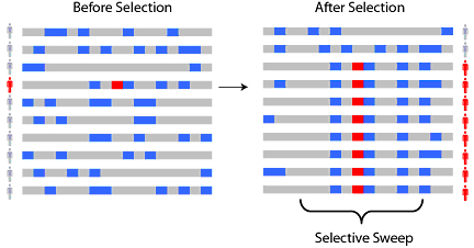
A new beneficial mutation arises in an individual (shown in red). It will rise in frequency in the population, leading to a characteristic reduction in diversity. Over time, genetic recombination and new mutations will build back the diversity, and the signal is lost.

Eventually, new mutations will creep in again, and generations of sexual reproduction would build back the diversity. However, if the loss of diversity was sudden enough (strong selection) and not too long ago, you can still detect it today. There are statistical tests (Fst, iHS, XP-EHH) that can formally detect if the reduction in diversity at a given region is sufficient to infer selection. Sabeti et al have a nice review paper that discusses the different methods available to detect selection using genomic data.

Our Results

We used three different methods to detect selection, and our top candidate regions under selection are considered significant by at least two of the methods.
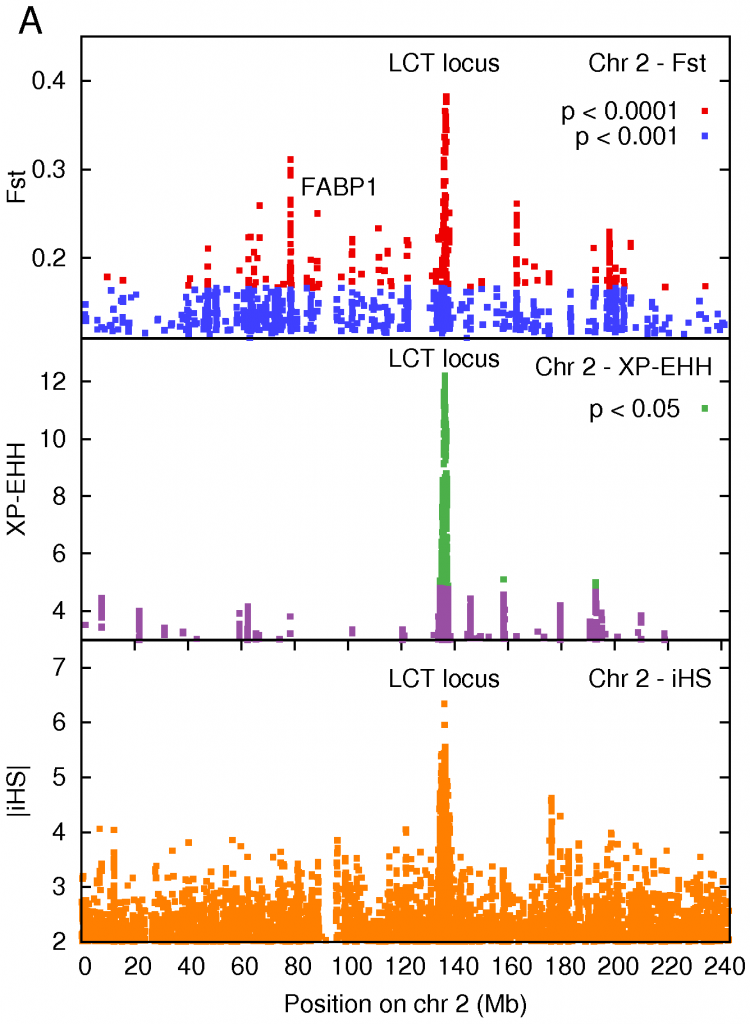
The strongest signal of selection, detected by all 3 methods, was a region on Chromosome 2 containing the Lactase gene (LCT), responsible for breaking down the lactose present in milk. Mutations in a neighboring gene in the cluster, MCM6, are associated with the ability to digest lactose in adulthood.

The strongest signal of selection was a region on Chromosome 2 that contained the LCT gene producing lactase, the enzyme that breaks down the lactose in milk. Interestingly, the default state in all adult mammals is to stop producing lactase in adulthood – our ancestors were all ‘lactose intolerant’. This makes sense from an evolutionary point of view, it forces children to wean from milk, and frees up the mothers resources. It turns out that different sets of mutations arose that gave European and African pastoralists the ability to digest milk. Those of us whose ancestors weren’t pastoralists still have trouble digesting milk.

This is a classic example of a selective sweep – a mutation confers an advantage (the ability to digest milk), and then sweeps through a population like wildfire. This result has been previously described in European populations, and also in African populations (including the Maasai) by Sarah Tishkoff and collaborators. Given that the Maasai consume large amounts of milk, it is not surprising that we see a very strong signal at this locus. We sequenced DNA in this region to confirm this result and, sure enough, we found that one of the lactase persistence conferring mutations identified by Tishkoff was present in the HapMap Maasai samples.

Two of the tests for selection that we used require that you make comparisons with another population. We chose the Luhya of Kenya as a our reference population. Among all the protein-altering mutations present in the data, the one that showed the largest population difference between the Maasai and Luhya (as measured by Fst) sits in the gene for a fatty acid binding protein FABP1. This protein is expressed in the liver, and the variant that occurs at higher frequency in the Maasai is associated with a lowering of cholesterol levels in Northern German women (n = 826) and in French Canadian men consuming a high fat diet (n = 623). Furthermore, studies in mice fed a high fat, high cholesterol diet showed that deactivating the FABP1 protein leads to protection against obesity, and lower levels of triglycerides in the liver, when compared to normal mice on an identical diet. These results suggest that this protein plays a role in regulating lipid homeostasis, and its selection in the Maasai may be diet-related.

On Chromosome 7, two of the methods we used to detect selection identified a cluster of genes that fall in the Cytochrome P450 Subfamily 3A (CYP3A). This family of genes is involved in drug metabolism, in oxidizing fatty acids, and in synthesizing steroids from cholesterol.

What’s next?

Computational methods can only take you so far. We have identified genes in candidate regions undergoing positive natural selection in the Maasai, possibly arising due to their unusual diet. But the case for selection can only be definitively made with an experimental study targeted to address the role of these genes in maintaining cholesterol homeostasis. We’re hoping to collaborate with experimental biologists to take these hypotheses forward and investigate their role in the evolutionary history of the Maasai.

So head over to PLOS, check out the paper, and let us know what you think.

Update: Here’s another blog post that discusses the paper, focusing more on the mixed genetic makeup of the Maasai.

References:

Kshitij Wagh, Aatish Bhatia, Gabriela Alexe, Anupama Reddy, Vijay Ravikumar, Michael Seiler, Michael Boemo, Ming Yao, Lee Cronk, Asad Naqvi, Shridar Ganesan, Arnold J. Levine, Gyan Bhanot (2012). Lactase Persistence and Lipid Pathway Selection in the Maasai PLOS ONE, 7 (9) : 10.1371/journal.pone.0044751

If you’d like to read more about selective sweeps, you may enjoy my post Why moths lost their spots, and cats don’t like milk. Tales of evolution in our time.
The crayola-fication of the world: How we gave colors names, and it messed with our brains (part II)

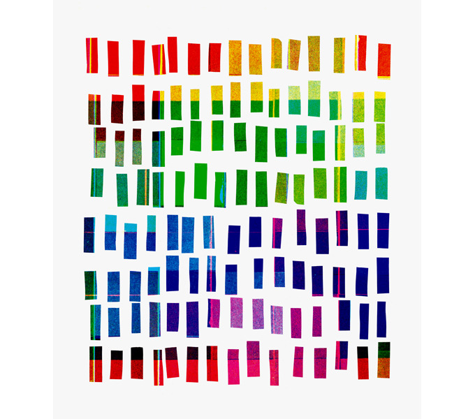
Untitled (Cubes) by Scott Taylor

Update: This post was an Editor’s pick by Cristy Gelling at Science Seeker, and was included in Bora Zivkovic‘s top 10 science blog posts of the week.

Lately, I’ve got colors on the brain. In part I of this post I talked about the common roads that different cultures travel down as they name the colors in their world. And I came across the idea that color names are, in some sense, culturally universal. The way that languages carve up the visual spectrum isn’t arbitrary. Different cultures with independent histories often end up with the same colors in their vocabulary. Of course, the word that they use for red might be quite different – red, rouge, laal, whatever. Yet the concept of redness, that vivid region of the visual spectrum that we associate with fire, strawberries, blood or ketchup, is something that most cultures share.

So what? Does any of this really matter, when it comes to actually navigating the world? Shakespeare famously said that a rose by any other name smells just as sweet. So does red by another name look just as deep? And what if you didn’t have a name for red? Would it lose any of its luster? Would it be any harder to spot those red berries in the bush?

Rose coloured glasses by jan_clickr

This question goes back to an idea by the American linguist Benjamin Whorf, who suggested that our language determines how we perceive the world. In his own words,

We cut nature up, organize it into concepts, and ascribe significances as we do, largely because we are parties to an agreement to organize it in this way—an agreement that holds throughout our speech community and is codified in the patterns of our language […] all observers are not led by the same physical evidence to the same picture of the universe, unless their linguistic backgrounds are similar

This idea is known as linguistic relativity, and is commonly described by the blatantly false adage that Eskimos have a truckload of words to describe snow. (The number of Eskimo words for snow probably tells you more about gullibility and sloppy fact-checking than it does about language.)

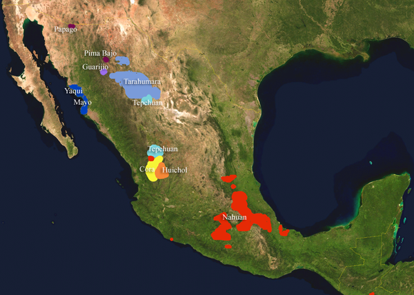
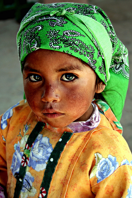
Hyperbole aside, color actually provides a neat way to test Whorf’s hypothesis. A study in 1984 by Paul Kay and colleagues compared English speakers to members of the Tarahumara tribe of Northwest Mexico. The Tarahumara language falls into the Uto-Aztecan language family, a Native American language family spoken near the mountains of North America. And like most world languages, the Tarahumara language doesn’t distinguish blue from green.

The Tarahumara language falls among the southern Uto-Aztecan languages. Image credit: Wikimedia Commons

The researchers discovered that, compared to the Tarahumara, English speakers do indeed see blue and green as more distinct. Having a word for blue seems to make the color ‘pop’ a little more in our minds. But it was a fragile effect, and any verbal distraction would make it disappear. The implication is that language may affect how we see the world. Somehow, the linguistic distinction between blue and green may heighten the perceived difference between them. Smells like Whorf’s idea to me.

Do you see what I see? A young girl from the Tarahumara tribe, whose language doesn’t distinguish green from blue. Photo credit: Fano Quiriego

That was 1984. What have we learnt since? In 2006, a study led by Aubrey Gilbert made a rather surprising discovery. Imagine that you’re a subject in their experiment. You’re asked to stare at the cross in the middle of the screen. A circle of colored tiles appear. One of the tiles is different from the others. Sometimes it will be on the left, and other times on the right. Your task is to spot whether the odd-color-out is on the left or on the right. Keep your eyes on the cross.

That’s easy enough. What’s the catch?

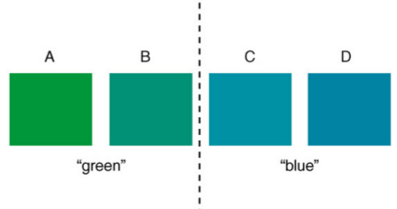
Well, sometimes you’ll also get a picture that looks like this.

See the difference? In one case, English speakers have different words for the two colors, blue and green. So there’s a concept that builds a wall between them. But in other cases like above, the two colors are conceptually the same.

Here’s what the researchers wanted to know. If you have a word to distinguish two colors, does that make you any better at telling them apart? More generally, does the linguistic baggage that we carry effect how we perceive the world? This study was designed to address Whorf’s idea head on.

As it happens, Whorf was right. Or rather, he was half right.

Continue reading The crayola-fication of the world: How we gave colors names, and it messed with our brains (part II)

The crayola-fication of the world: How we gave colors names, and it messed with our brains (part I)

“Who in the rainbow can draw the line where the violet tint ends and the orange tint begins? Distinctly we see the difference of the colors, but where exactly does the one first blendingly enter into the other? So with sanity and insanity.”

—Herman Melville, Billy Budd

Spectral Rhythm. Screen Print by Scott Campbell.

This post was chosen as an Editor's Selection for ResearchBlogging.org

In Japan, people often refer to traffic lights as being blue in color. And this is a bit odd, because the traffic signal indicating ‘go’ in Japan is just as green as it is anywhere else in the world. So why is the color getting lost in translation? This visual conundrum has its roots in the history of language.

Blue and green are similar in hue. They sit next to each other in a rainbow, which means that, to our eyes, light can blend smoothly from blue to green or vice-versa, without going past any other color in between. Before the modern period, Japanese had just one word, Ao, for both blue and green. The wall that divides these colors hadn’t been erected as yet. As the language evolved, in the Heian period around the year 1000, something interesting happened. A new word popped into being – midori – and it described a sort of greenish end of blue. Midori was a shade of ao, it wasn’t really a new color in its own right.

One of the first fences in this color continuum came from an unlikely place – crayons. In 1917, the first crayons were imported into Japan, and they brought with them a way of dividing a seamless visual spread into neat, discrete chunks. There were different crayons for green (midori) and blue (ao), and children started to adopt these names. But the real change came during the Allied occupation of Japan after World War II, when new educational material started to circulate. In 1951, teaching guidelines for first grade teachers distinguished blue from green, and the word midori was shoehorned to fit this new purpose.

Reconstructing the rainbow. Stephanie, who blogs at 52 Kitchen Adventures, took a heat gun to a crayola set.

In modern Japanese, midori is the word for green, as distinct from blue. This divorce of blue and green was not without its scars. There are clues that remain in the language, that bear witness to this awkward separation. For example, in many languages the word for vegetable is synonymous with green (sabzi in Urdu literally means green-ness, and in English we say ‘eat your greens’). But in Japanese, vegetables are ao-mono, literally blue things. Green apples? They’re blue too. As the Viagra pill, it is also blue. As are the first leaves of spring, if you go by their Japanese name. In English, the term green is sometimes used to describe a novice, someone inexperienced. In Japanese, they’re ao-kusai, literally they ‘smell of blue’. It’s as if the borders that separate colors follow a slightly different route in Japan.

And it’s not just Japanese. There are plenty of other languages that blur the lines between what we call blue and green. Many languages don’t distinguish between the two colors at all. In Vietnamese the Thai language, khiaw means green except if it refers to the sky or the sea, in which case it’s blue.  The Korean word purueda could refer to either blue or green, and the same goes for the Chinese word qīng. It’s not just East Asian languages either, this is something you see across language families. In fact, Radiolab had a fascinating recent episode on color where they talked about how there was no blue in the original Hebrew Bible, nor in all of Homer’s Illiad or Odyssey!

(Update: Some clarifications here. Thanks, Ani Nguyen, for catching the mistake about Vietnamese. See her comment below about how the same phenomenon holds in Vietnamese. Also, the Chinese word qīng predates modern usage, and it mingles blues with greens. Modern Chinese does indeed distinguish blue from green. Thanks to Jenna Cody for pointing this out, and see her insightful and detailed comment below.)

I find this fascinating, because it highlights a powerful idea about how we might see the world. After all, what really is a color? Just like the crayons, we’re taking something that has no natural boundaries – the frequencies of visible light – and dividing into convenient packages that we give a name.

Imagine that you had a rainbow-colored piece of paper that smoothly blends from one color to the other. This will be our map of color space. Now just as you would on a real map, we draw boundaries on it. This bit here is pink, that part is orange, and that’s yellow. Here is what such a map might look like to a native English speaker.

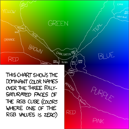
A map of color for an English speaker. Results of the XKCD Color Survey. Randall Munroe.

But if you think about it, there’s a real puzzle here. Why should different cultures draw the same boundaries? If we speak different languages with largely independent histories, shouldn’t our ancestors have carved up the visual atlas rather differently?

This question was first addressed by Brent Berlin and Paul Kay in the late 1960s. They wanted to know if there are universal, guiding laws that govern how cultures arrive at their color atlas.

Continue reading The crayola-fication of the world: How we gave colors names, and it messed with our brains (part I)