There’s been a lot of buzz lately in the science blogosphere about a recent experiment where physicists created a gas of quantum particles with a negative temperature – negative as in, below absolute zero. This is pretty strange, because absolute zero is supposed to be that temperature at which all atomic motion ceases, where atoms that normally jiggle about freeze in their places, and come to a complete standstill. Presumably, this is as cold as cold can be. Can anything possibly be colder than this?
Here’s the short answer. It is possible to create negative temperatures. It was actually first done in 1951. But it’s not what it sounds like – these temperatures aren’t colder than absolute zero. For instance, you can’t keep cooling something down to make its temperature drop below absolute zero. In fact, as I’ll try to explain, objects at a negative temperature actually behave as if they’re HOTTER than objects that are at any positive temperature.
To understand this, we first need to know what physicists mean by temperature. You may remember from high school physics or chemistry that temperature measures the average kinetic energy of motion of particles. When you heat a substance, you’re speeding up its molecules, and when you cool it down, you’re slowing the molecules down.
This definition really made sense to me when I could see it for myself, so here is a simulation where you can play around with gas molecules. Go switch on the heater, and then turn up or down the heat, and see what happens.
So far, so good. But physicists realized that this definition of temperature doesn’t always work, because there are more types of energy than kinetic energy of motion. There are even situations where an object has an energy, but there isn’t really anything moving around in the conventional sense, like the magnetic spins in a magnet, or the ones and zeros on your hard disk. These are essentially quantum systems, where it doesn’t really make sense to talk about stuff moving, but you can still write down how much energy it has. It became clear that physics needed a more fundamental definition of temperature, that would make room for these possibilities.
Here’s the new definition that they came up with. Temperature measures the willingness of an object to give up energy. Actually, I lied. This isn’t how they really define temperature, because physicists speak math, not english. They define it as 
Now, if you don’t speak math, I’m going to let you in on a little secret. You don’t need to know any math or physics to understand how temperature works. You can use a surprisingly accurate analogy. I first heard this analogy as an undergraduate, in an excellent thermal physics textbook by Daniel Schroeder.

Picture a world where people are constantly exchanging money to attain happiness. This is probably not that hard for you to imagine. But there’s a small twist.
The people in this society have agreed that they will work to maximize happiness – not just their own happiness, but the total happiness in the society. This has surprising consequences. For example, there might be some people who get very happy when they earn a little money. We could call them greedy. Other people don’t really care much about money – they become a little happier when they earn some money, and a little sadder when they lose it. These people are generous – if they’re playing by the rules of the game, they ought to give money to greedy people, to raise the overall happiness of society.
So why am I inventing this socialist utopia with rampant income redistribution? It’s because this is closely analogous to the physics of heat (as Steven Colbert put it, reality has a well know liberal bias).
Here’s the analogy. The socialist commune is what physicists call an isolated system. The people are the objects in this system. The money that they exchange is really energy – a quantity whose total amount is conserved, but that is constantly being exchanged. Happiness is entropy – just as the society wants to maximize happiness, physical systems are driven to maximize their total entropy. And finally, generosity is temperature, the willingness of people (i.e. objects) to give up money (i.e. energy).
This is a lot to swallow, so here’s a handy dictionary that lets you translate from our analogy to real physics:


By looking up this dictionary, everything that we say about our commune is translated into a statement about physics.
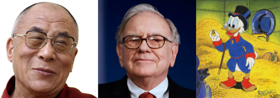
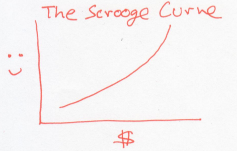
Now, imagine that our society consists of people like Warren Buffett. Initially, when they’re poor, getting money makes them very happy. But as they get wealthier, the same amount of money doesn’t make them nearly as happy. If you plot the happiness of these Buffett-like people versus their wealth, it would look something like this.
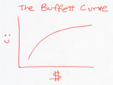
In this world, every dollar earns you less happiness than the last one. So to raise the overall happiness, a rich Buffett should give money to a poor Buffett. This is a world where people become more generous as they acquire money. Or a system whose temperature rises as it gains energy.
The Buffett curve describes normal particles that we know and love, whose temperatures rise as you heat them. These are the jiggling atoms in solids, liquids, or gases.
Now, instead, consider a world of people who are misers, like Uncle Scrooge. Every dollar they earn makes them more happy than the previous dollar did.
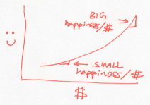
Unlike the Buffetts, if a rich Scrooge gives a dollar to a poor Scrooge, this would lower the overall happiness of Scrooges. In other words, the Scrooges generosity decreases as they acquire more money. Using our dictionary, this is a system whose temperature drops as it gains energy.
Chew on that last thought for a moment. Could you really have an object that gets colder as you give it energy?
This really happens, when you have a bunch of particles that attract each other. Stars are held together by gravity, and they behave in just this way. As a star loses energy, its temperature rises. Give a star energy, and you’re actually cooling it down. Black holes also behave in this odd way – the more energy you feed them, the bigger they get, and yet, the colder they get.
And if that wasn’t counter-intuitive enough for you, here’s another scenario. Picture a world of people who have attained enlightenment – they actually become happier when they lose money.
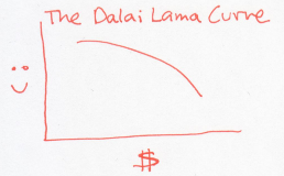
In this example, every dollar that the Dalai Lama receives actually makes him sadder. The natural tendency, then, is to give away all his money to whoever is willing to take it. This odd, inverted curve, is exactly the situation that results in negative temperatures – just relabel happiness to entropy and money to energy (mathematically, the curve has negative slope, so it must have negative temperature).
What happens when a negative temperature object meets a positive temperature object? To find out, imagine that the Dalai Lama meets Warren Buffett.
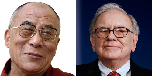
Paradoxically, the Dalai Lama will give his money away to the billionaire, because losing money will make the Dalai Lama happier, and gaining money will make Waren Buffett just a teeny bit happier. In this strange exchange, the net happiness goes up. Using our dictionary, energy flows from a negative temperature object to an object that is at any positive temperature!
This might sound like something dreamt up by an over-zealous theorist. But there are real materials where the entropy versus energy curve looks like the Dalai Lama’s happiness versus money curve, i.e. where the temperature is negative.
To get here, you first need to engineer a system that has an upper limit to its energy. This is a very rare thing – normal, everyday stuff that we interact with has kinetic energy of motion, and there is no upper bound to how much kinetic energy it can have.
Systems with an upper bound in energy don’t want to be in that highest energy state. Just as the Dalai Lama is not happy with a lot of money, these systems have low entropy in (i.e. low probability of being in) their high energy state. You have to experimentally ‘trick’ the system into getting here.
This was first done in an ingenious experiment by Purcell and Pound in 1951, where they managed to trick the spins of nuclei in a crystal of Lithium Fluoride into entering just such an unlikely high energy state. In that experiment, they maintained a negative temperature for a few minutes. Since then, negative temperatures have been realized in many experiments, and most recently established in a completely different realm, of ultracold atoms of a quantum gas trapped in a laser.
From black holes to quantum gases, this analogy shows us that temperature is a lot more subtle than what we measure on a thermometer.
References
Here’s a very charming blog post that explains temperature using Leprechauns and Laser Beams.
The money and happiness analogy is not my own, but borrowed from the marvelous physics textbook Thermal Physics by Daniel Schroeder.
Statistical Mechanics by Pathria and Beale has a nice discussion on how magnetic systems can realize negative temperatures (via Tim Prisk).
John Baez’s blog on negative temperature and the entropy of stars.


 is time,
  is the vertical launch speed of the ball at time zero, and
  is the one number that everyone remembers from a physics course – the acceleration due to gravity, which is
  .
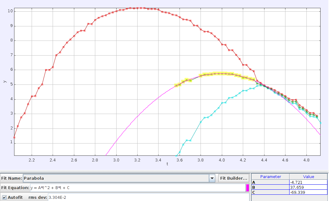
. term in that equation, and multiply it by two. You should recover the acceleration due to gravity
  .
.
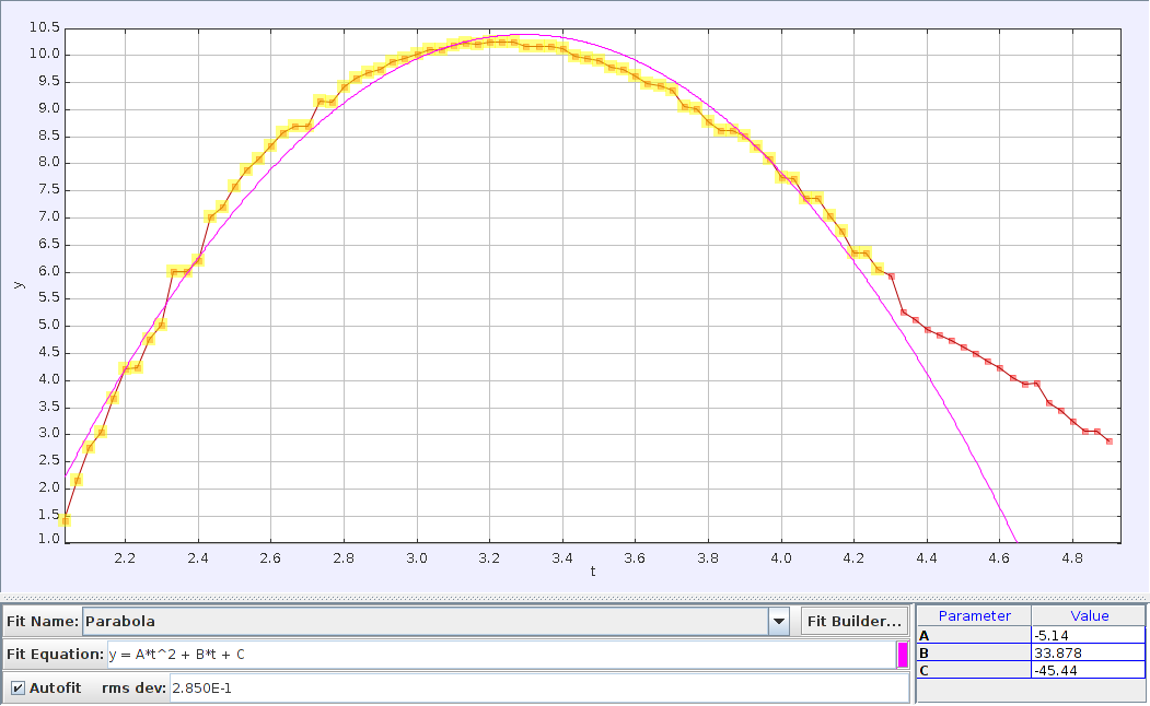
 . That’s just 5 percent away from the actual value, which is far more accurate than we have any reason to expect.
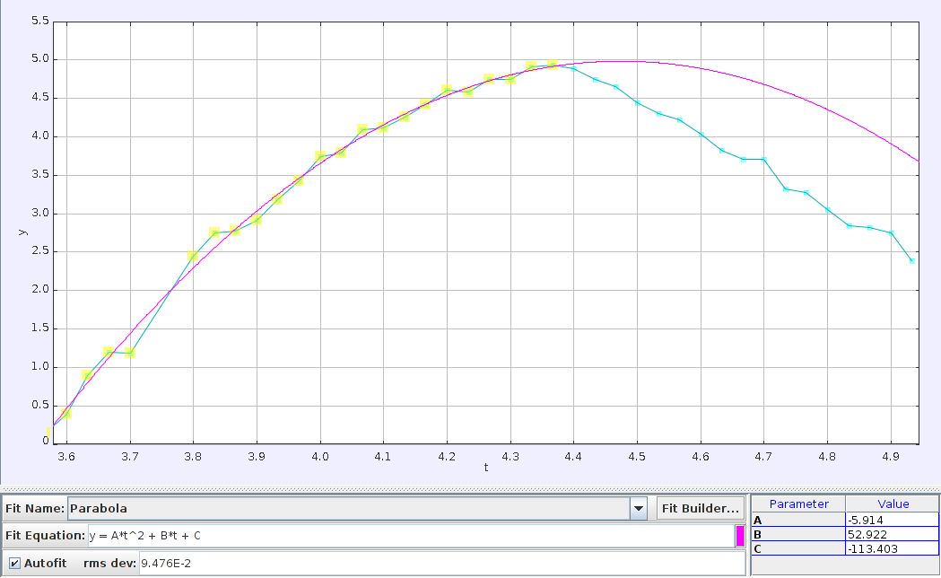
 , which is about 17 percent away from the known value. Again, not too shabby. (The pink line is what you would expect if you extrapolated the balls trajectory to after the collision. In reality, of course, it smacked into the other ball and made a significant course adjustment).
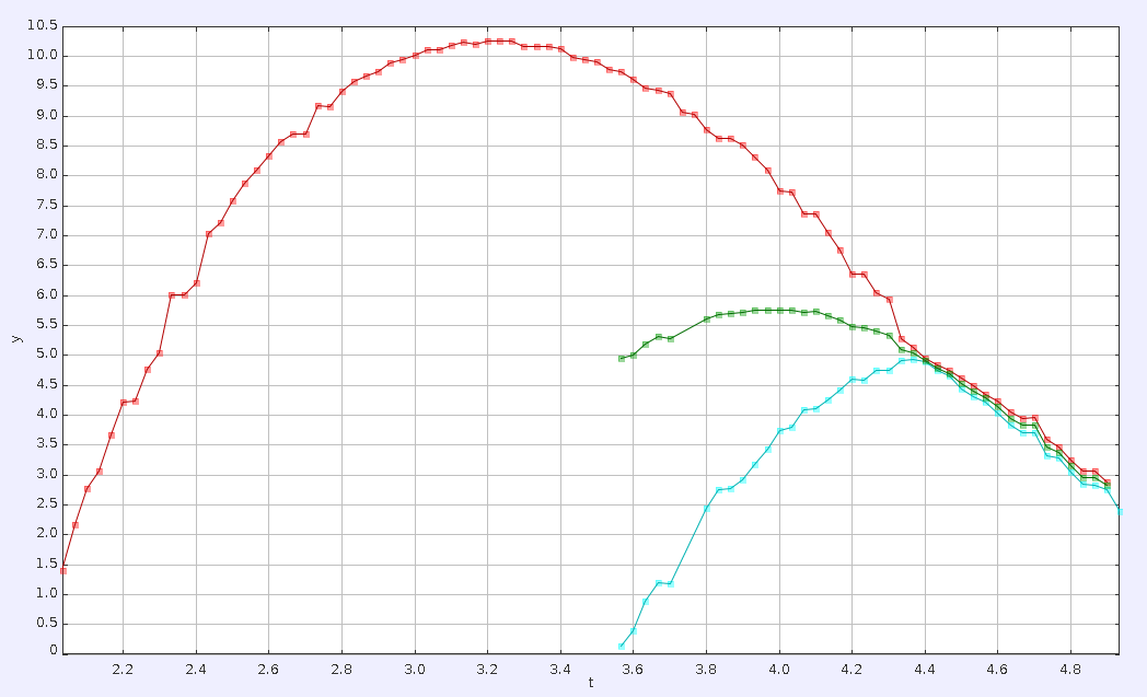


 to bring stuff with mass
  up to a speed
  .
.


